

An awareness ribbon for misophonia? The story.
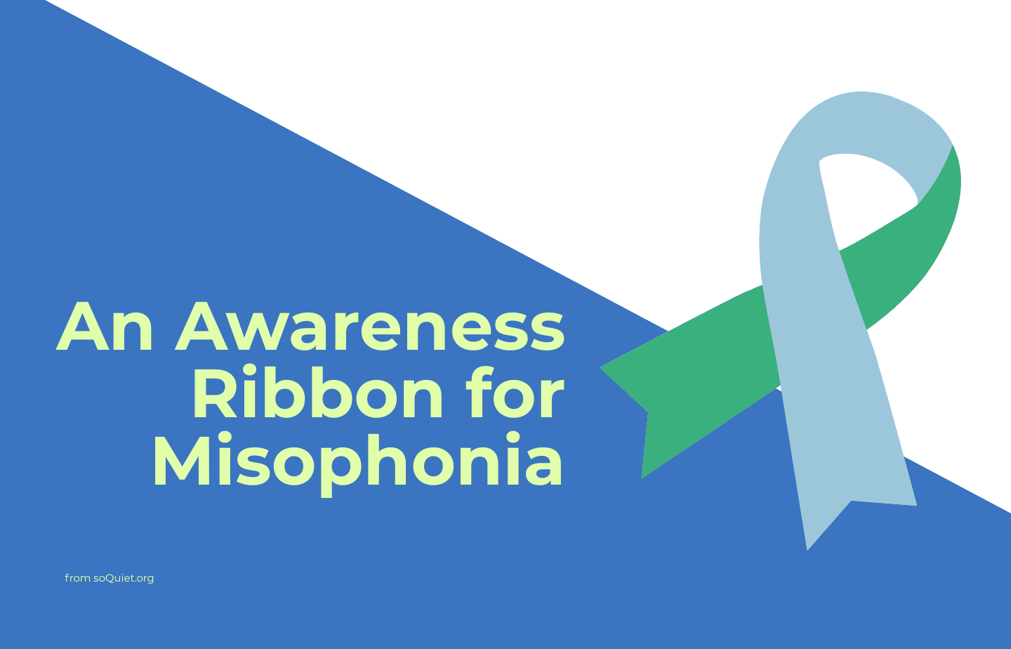
Misophonia is not rare, so why wasn’t there a universal awareness ribbon for it?
“Is there an awareness ribbon for misophonia?”
We’ve received this question numerous times over the years. Prior to this year [2026], there wasn’t really an answer. So, for 世界ミソフォニア啓発デー and Disability Pride Month in July of 2026, soQuiet decided to propose a solution to this situation.
Background
Most of us are probably familiar with the concept of “awareness ribbons.” These are used as symbols to show support for a particular cause. For example, a pink ribbon is well-known as a way to show support for breast cancer.
Research and awareness about misophonia have been growing; misophonia is not rare at all, affecting about 5 percent of the population. With very active research, support options, and prevalence data on misophonia, the need for a unique misophonia awareness ribbon, a symbol of the movement to support understanding and hopefulness about the disorder, seemed like something that needed to exist.
But, was there already a misophonia awareness ribbon? And, what would a misophonia awareness ribbon look like?
An earnest candidate
When we were researching this topic, we needed to see if, perhaps, an awareness ribbon for misophonia already was being used. Though we at soQuiet do our best to keep up with the misosphere as best as we can, just because we aren’t aware of something doesn’t mean it doesn’t exist. As it turns out, there was one possible awareness ribbon candidate that could be found.
A website called MisophoniaUK does have a misophonia ribbon that is dark blue and this version has been in existence for years.
That settles it? Not quite.
Lack of community usage
One issue with this is that it had not been adopted widely by the misophonia community, the misosphere. We’d never seen it in our 6-ish years of existence and several of our advisors who have been active in misophonia research and advocacy for many years also had not seen it.
Doing some research online, we found a few sellers on sites like Etsy and Redbubble who had used this dark blue ribbon idea on products, but none of the major organizations and advocates in the misosphere were using this design.
Also, the MisophoniaUK website lists a copyright date of 2012, meaning that this design likely was proposed almost a decade and a half ago and hadn’t been used widely since then by the community.
Sinking in a dark blue sea
Perhaps a larger concern: many other causes また use a dark blue ribbon for their awareness programs. This could lead to confusion about what a particular ribbon is actually 対して.
According to wikipedia and other resources, the color of dark blue is already used for awareness initiatives including [among many others]:
Addiction Recovery
Alopecia
Acute Respiratory Distress Syndrome
Hydrocephalus
Mourning and honoring a police officer killed in the line of duty
Myalgic Encephalomyelitis/Chronic Fatigue Syndrome
Electronic Freedom Foundation's Blue Ribbon Online Free Speech Campaign
Parkinson's disease awareness
Canada's National Non-Smoking Week
"Stand With ACLU" initiative
Arthritis
Child abuse prevention
Colon/Colorectal cancer awareness
and many others.
This means that the dark blue ribbon for misophonia would be lost in a sea of confusion with other causes. If you wore a blue ribbon for misophonia awareness, others might think you are supporting a completely different initiative.
A unique design
As we thought about this, it became clear that misophonia needs its own design, a recognizable ribbon that means “misophonia awareness” and nothing else.
We needed to propose a unique design that won't be confused for others and that could be adopted by the misophonia community more than previous attempts in the past.
As we looked more into what colors might not already be associated with any existing awareness campaign for something else, we came up short. As it turns out, almost any conceivable solid color is claimed as the awareness ribbon color for something else: gold, orange, lime green, etc. They all have historical usage to represent a different campaign.
Clearly, we needed something besides a solid color for a unique design specifically for misophonia.
A landmark: The disability flag
As we began thinking about this and researching colors and their associated meanings, we happened to be struck by the Disability Flag, which was designed by artist Ann Magill in 2021.
![Disability Pride Flag by Ann Magill [Image in the public domain. From wikipedia]](https://images.squarespace-cdn.com/content/v1/606f8d795804782226418084/5a4d8416-8fbb-4119-b89b-e45f3fd0be3e/Disability+Pride+Flag+by+Ann+Magill+%5BImage+in+the+public+domain.+From+wikipedia%5D)
Disability Pride Flag by Ann Magill [Image in the public domain. From wikipedia.]
Each stripe of the Disability Flag [aka Disability Pride Flag] represents a different facet of the disabled community. The top stripe, which is a green color, represents “sensory disabilities.”
After surveying some of our collaborators, many liked the use of this color as it is founded in something that was already being done for disorders and conditions like misophonia. This color was known to represent the category that misophonia exists within: the senses.
However, solid green, as you might expect, is also already claimed by many other awareness projects. It seemed natural to use this color, but we asked: how do we include green if people know it for something else?
The inspiration
In 2024, we created 世界ミソフォニア啓発デー [WMAD] in honor of Michelle Del Valle; her birthday, July 9, is the day chosen for this annual event.
Within the realm of the WMAD project, we use some colors which are different than the soQuiet colors. Most notable is the color blue. This color was used because of its use in this illustration that Michelle Del Valle had drawn:
![An illustration of a girl's head. The illustration is black and white with the exception of the eyes which are pale blue. [Illustration by Michelle Del Valle. Used with permission from the Del Valle Family]](https://images.squarespace-cdn.com/content/v1/606f8d795804782226418084/4812fd46-4bfb-4014-a0e0-3065ebad178d/The+pale+blue+eye+color+inspired+the+colors+used+for+World+Misophonia+Awareness+Day+%5BIllustration+by+Michelle+Del+Valle.+Used+with+permission+from+the+Del+Valle+Family%5D)
The pale blue eye color inspired the colors used for World Misophonia Awareness Day [Illustration by Michelle Del Valle. Used with permission from the Del Valle Family.]
Michelle was an artist and this pale blue color in her illustration is so striking that we felt this was also a very appropriate and symbolic color to use for an awareness ribbon.
So, with two colors that felt like they represented the goal of World Misophonia Awareness Day and of misophonia overall, things fell into place quickly.
The design and proposal
Clearly, the answer to the “unique design” was to create a two-tone ribbon. This would allow for the use of two relevant colors which represent important aspects of misophonia: sensory disability awareness and the vision of the lived experiences of people who struggle with misophonia.
Additionally, this would solve the issue presented by solid colors: no other awareness campaigns would have this exact design.
So, we quickly created a mock-up of a two-tone ribbon design using the Disability Flag green which represents sensory disabilities, as well as the pale blue color from Michelle Del Valle’s illustration.
Here is what we created:
![A diagram of the meaning behind the Misophonia Awareness Ribbon. [Image by soQuiet]](https://images.squarespace-cdn.com/content/v1/606f8d795804782226418084/2def7738-9a92-4f20-823f-3f7d6740055d/A+diagram+of+the+meaning+behind+the+Misophonia+Awareness+Ribbon.+%5BImage+by+soQuiet%5D)
A diagram of the meaning behind the Misophonia Awareness Ribbon. [Image by soQuiet]
After creating this two-tone design and the image above to explain its inspiration and meaning, we sent it to a group of misophonia advocates and organizations for their input.
The response was positive, so we also posted this on our social media accounts in the lead-up to WMAD 2026 and, again, the response was generally very positive.
So, what do you think of this design?
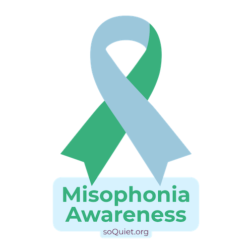
Misophonia Awareness Ribbon